If you’re someone who uses Confluence daily, you may have felt that after some time it gets a bit dull to look at. Yes, you can change the banner color and the instance icon, but that’s about it.
There is no smart new way of organizing your spaces, no way to categorize pages and content or personalize Confluence in it’s essence.
Refined to the rescue
If you want to get more out of Confluence, then take a look at Refined for Confluence. This nifty plugin lets you really get down to business by customizing your instance.
From a few smart templates to a completely blank slate where you can get your hands dirty with some CSS!
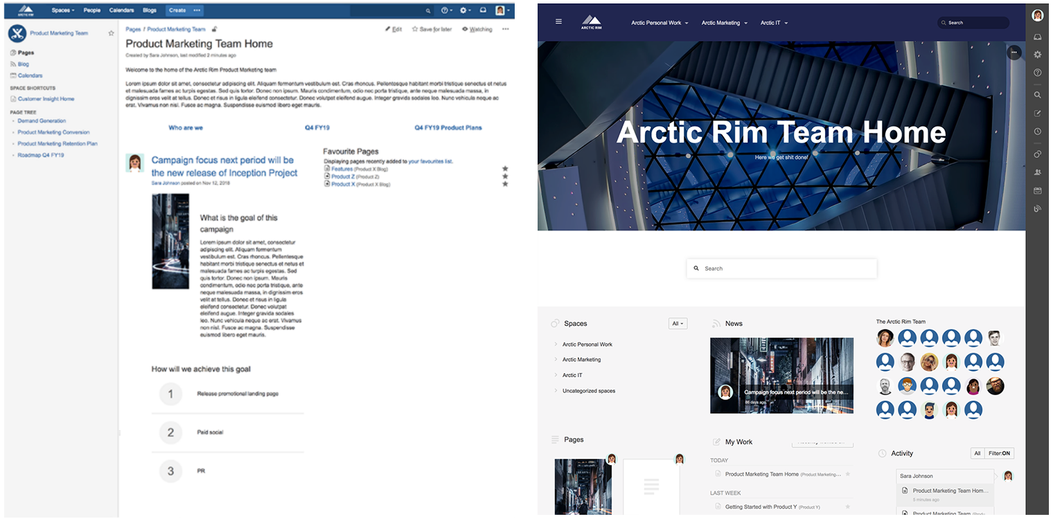
Here is one example of how Confluence looks before and after customization with Refined plugin:

Before and after
How to install the Refined plugin
By using the capabilities of CSS in the making of your own instance template, you will be able tailor the perfect setup for your instance.
Refined is just as easy to install as any other plugin, just head to the plugin/addon section on your Confluence instance and search for the Refined plugin for Confluence.
Once it’s installed, you can begin the customization of your instance right away. If you have any troubles, Eficode ROOT team is here to help you out!
“I've been doing editing only through the GUI and CSS, they give you a lot of options to edit the usability and visuality of Confluence....We've been mostly doing Refined theme edits for clients to make Confluence feel like part of their brand identity so the people who use it feel familiar with the look. The customisation through CSS is not the most secure way since it can break when Confluence is updated. However, for changing the visual look it has been the best way!“ - Sanni Partanen, UX Designer from Eficode about her experience with Refined
Confluence categorization to improve UX
Refined introduces a new concept of categories. Categories ties together spaces under a name, which makes it extremely user friendly to find spaces, for example, by department. This way you can tie together spaces that have something to do with similar content, like having all of the HR spaces, regarding recruitment, internal relations, support, etc. under the same category “HR”.
What’s more, you can set a custom front page and customize the way a category is displayed, just like you would with a space, providing quick links and other content right at the front page.
By using categories, you have the ability to control and administer permissions for a set of spaces vs. having to do the same job over and over on each of the spaces. Of course, you can still use the permission scheme on each space at the same time, making it essentially a new layer of security for your Confluence instance.
Using ‘Sites’ on Confluence
On top of Categories, we have the concept of “Sites”. Sites is the overall categorization for your Confluence instance. On the Sites page, you can see all the categories of the organization, such as HR, IT, Operations, Business announcements, etc.
The Sites page is the central page where you go back to and figure out where to go. It provides a landing page for new and current employees. Furthermore, Sites can be customized to suit your overall company look with the power of CSS.
Easy-to-use and highly customizable
All in all, Refined for Confluence creates an easy-to-use and highly customizable experience for you to play with. It provides some great features including higher level of components, site builder and new security levels for your Confluence instance.
So, if you want your customers and employees to have a more pleasant time working with Confluence, install the Refined plugin and see what it can do for your instance. If you encounter any problems, Eficode ROOT team is happy to help you out!
Published: Feb 13, 2019
Updated: Mar 26, 2024


