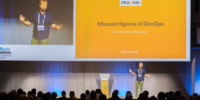
Watch this talk from DevOpsDays Zurich
Published: Jul 6, 2019
Updated: Mar 26, 2024

Watch this talk from DevOpsDays Zurich
In the world of Agile and DevOps we use many figures, charts and diagrams to argue and reason about our world and how we prioritize and make choices. However, at all levels of the organization, we misuse and misinterpret figures. It’s time to be explicit, measure the right things and act on them. Watch this talk from DevOpsDays Zurich in May 2019.
You can’t say Agile without having drawn at least a few quadrants with axes scaling from “good” to “bad” or from “good” to “could have been better”. Unfortunately many of these important visualizations are misunderstood at best and abused at worst. We go through coming figures and check our cognitive biases. For each figure we cover the misunderstanding, the consequence and ways to address this.
Published: Jul 6, 2019
Updated: Mar 26, 2024
Exclusive educational content and news from the Eficode world. Right in your inbox.