Eficode designs Taikala’s full-featured myClub mobile app

Eficode helped Taikala to design a full-featured myClub mobile app for sports clubs. The mission was clear: deliver one app that truly suits all needs.
Taikala’s myClub app is a comprehensive management system for practically any kind of sports club. It doesn’t matter whether it’s a small club or a major organisation – or even what sport, for that matter. The same applies to the user base; while most users manage their own club memberships via myClub, some may also manage their family members’ accounts too, or perhaps even more.
Eficode’s job was to design a full-featured myClub mobile app that offers the same flexibility as its web counterpart, without sacrificing usability. The mission was clear: deliver one app that truly suits all needs.
“We have been very pleased with Eficode’s work and to have their UX designer as part of our development team.” – Kai Tulonen, CEO of Taikala
Analyzing the existing service
Eficode’s experts began the project by analyzing the existing web service, creating simple user personas to track some of the more complex use cases.
The biggest challenge was to upgrade the user experience so that it made more sense on mobile platforms. Crucially, this had to be done without any major changes to the actual features and data structure, as the existing web version of myClub remains the primary way to use the service.
Creating modular views
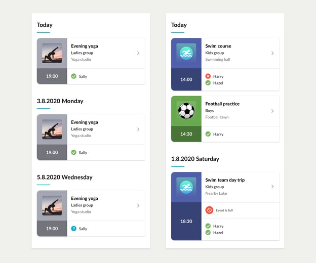
Eficode’s experts created modular views to ensure a great user experience. The modular model enables the application to show all content from multiple memberships on the same page, without having to constantly switch between membership profiles.
So instead of keeping track of multiple club-specific event lists, the user is now able to see all of their events on one simple list. This allows for much easier scheduling.
Should the user have same team memberships linked to their myClub account, the team events are listed only once (rather than one per membership), as the event cards and pages are also fully modular.

Same view for users with either single or multiple memberships
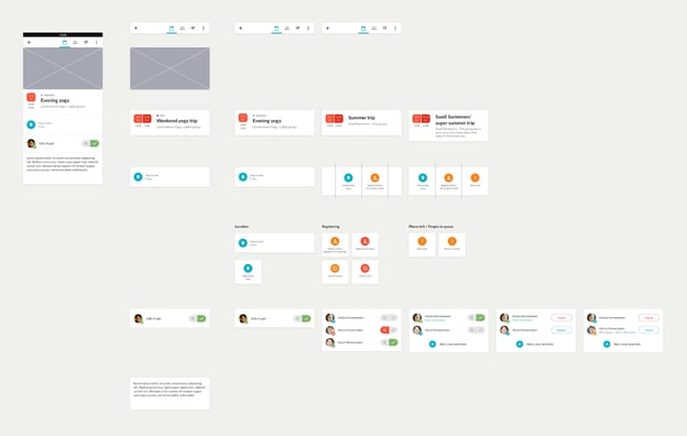
myClub’s mobile event view is also a great example of the level of modularity in the app. The view itself serves a fairly simple function – the user has to be able to see all the necessary details and enroll in the event – but the sections differ based on the event attributes and how many same team memberships the user is managing.

The event view can be a combination of any variations, depending on the event type and how many same team memberships the user is managing
Themes for sports clubs
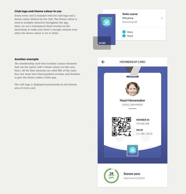
Themes were needed to differentiate the content between sports clubs – and every view in the myClub app is designed with this in mind.
Clubs have the ability to add a logo and set a theme color – which uses accent color in select UI elements, such as the sidebar in event cards – as well as using custom images for their events.
The main challenge here was to design the views so that they could use practically any color available, without affecting readability.

Sports clubs can use any theme color they want, without affecting readability. Avatar generated by thispersondoesnotexist.com
Key achievements
- A more user-friendly app, boasting all the features of the web version.
- A guiding UI that helps users to better understand the difference between their myClub account and various club membership accounts.
- Easier onboarding for new and existing users.
- More options for club branding/look and feel, while maintaining uniformity between app views.
- All content from different clubs listed on the same feed, instead of needless profile switching.

